Friday, 30 September 2011

Digipack Analysis - Flobots

On the front cover of this album, it shows the scenery being bad weather conditions with thundering and lightening in the sky indicating a torrential storm is being created this backs up the name of the album called survival story. On the front cover of the album it doesn’t have any people on apart from one person standing alone on land which is very limited with a giant wave coming towards him, this supports the album name survival story. The font colour is in large white font which is positioned in the middle of the cover helping it stand out and matching the image in the background which has the same colours.
The back of the CD cover shows a town which was once a thriving town but is now run down or destroyed as the buildings are smashed and the debris on the ground is in large amounts looking like former buildings which have been destroyed due to the storm, this once again indicates the “survival” bit in the name of the album. The colour scheme is mostly grey and dark which shows stormy colours. On the back of the cover it has the songs that are in the album using red font to make them stand out from the grey background.
Inside the album they have another image of the destruction with destroyed cars and smashed up buildings supporting the name of the album once more. Each section of the album cover shows the destruction in step by step as the front cover of the album starts off with the attack then the back showing the destruction in progress and the final section of the album shows the damage it has caused as the sunlight in the background is indicating the storm is starting to pass.
Inside the album the background is different compared to the outside as it is a red background with white font helping it stand out for the target audience to read it. One of the sections tells a little bit about the band and who is in it, whilst another bit of the inside of the album tells you about some of the lyrics in each of the songs. The middle section is the man who is on the front cover with a blank section only for a little bit of a quote underneath him.
From the analysis of this digipack I believe that my digipack should relate the front cover picture to the title of the song  and the inside should just contain some basic information about the band and some of the songs.


Digipack Analysis - Gorillaz

On the front cover of the Gorillaz album, which is called “plastic beach”, the album is a cartoon style layout set on an island in the middle of the ocean. On the island is a number of buildings and also a lighthouse this backs up the albums name “plastic beach” as next to the ocean is sand indicating the beach part of the name. The font of the name of Gorillaz plastic beach is in white large font which stands out from the dark background it’s in front of as it stands out as the picture is set during the night time period which helps the white stand out. The style of the font is very childish, blending in well with the image which is a cartoon.
On the back of the album, the background is white with an image placed in the middle of the page with the songs that are involved in the album underneath the image. The names of the songs are in black font making them clearly stand out for the audience to read as it’s placed on a white background. The image is another cartoon image with the characters on a boat indicating that they are traveling towards the island which is on the front of the cover.
In the inside of the album it is once again very fictional with the characters and all sorts of creatures this gives the impression that the band is very creative in the song choices. The use of the different colours inside the album are a contrast to what it is on the outside as it goes from dark colours to light colours.
From this album cover I will concentrate on the following elements:
·         The choice of text
·         The use of the image relating to the name of my album
·         Choosing whether to do a non-fictional or fictional style album cover.


Digipack Analysis - Humbug Arctic Monkeys


The front cover for 'Humbug' by arctic monkeys is simplistic. The colours on the image have been edited to give it a 'retro' and almost 'vintage' look. The photograph itself is casual and not posed, which looks like an off-guard moment caught on camera. The attire of the band is quite stereotypically 'indie', such as the denim jacket for example. The title 'arctic monkeys' is written in a small, signature font, which is placed over the white hoodie one of the band members is wearing. This is because the white contrasts with the dark green colour and makes it visually easy to read.

The back of the album is plain and simple, similar to the front cover. The background has no image, which is unusual for a digipack, and does not follow the regular codes and conventions. Usually the back of an album has an image of the band, but 'Humbug' does not, and keeps with the simplistic theme throughout. Although the back cover is extremely plain, it gives the illusion of being vintage, through the faded colouring. The title of the album is written in a significantly smaller font in contrast to the name of the band, which is written in a large, signiture 'arctic monkeys' font, and is the main focal point to the cover. The tracklisting is written in the same font as on the front cover, and is easy and simple to read. The barcode is placed at the side, which is unusual, as most digipaks place the barcode at the bottom corner. The small text underneath the tracklisting gives details about the record company, including their logo, and gives the official website of the arctic monkeys.

The disk for 'humbug' is simple, like the rest of the digipak. The faded colouring of the disk is similar to the back cover, and almost looks like it has been burnt at the edges, which also links in with the vintage theme. The only text is the large initials 'AM' which stands for 'Arctic Monkeys'

This digipack will influence our own, because the simplistic theme throughout is effective, which we will take on board when considering our own digipack. The image of the band will influence our own images because it looks as if they were caught off guard, and looks natural and simple.


Digipack Analysis - Lungs Florence & The Machine


The front cover of the album is unique and dramatic. A medium close up shows florence literally wearing a pair of lungs. The floral curtains, birds and blossoms in the background connote innocence, beauty, nature and gives a femenine feel to the album cover. However, the lungs which florence is wearing, almost as a necklance, and the black nail varnish, emphasises a slightly more darker and gothic feel to it. Florence's body language is relaxed and open, and her eyes being shut give the illusion of she's in a dream. The lungs could symbolise Florence's music as her life. It is almost as if she is trying to show that she couldn't live without her music, like a human cannot live without their lungs, which contrasts with the blossoms and birds behind her, which symbolise life and purity, whilst the lungs symbolise death. The image is framed in white, and the album name and artist name is written in white, which is visible against the black background. The font used for 'lungs' is written in a simple, plain font, to make it easy to read, whilst 'florence + the machine' is written in a different, more creative font. The album title is also bordered by two thin white lines, which makes 'lungs' more noticable and stand out.

The back cover continues with the colour theme of black and white. The image on the back cover is a diagram of a pair of lungs. The numbers on the lungs match up to the tracklist below, which is written in a bolder, italic font, each of the songs spaced close together. The barcode is on the right bottom hand side, which is a conventional feature to digipaks.

The disk of the album goes against the usual conventions. Usually CD disks follow the colour theme or the visual theme, but the 'lungs' disk does not. The image on the disk is of a pair of hands grasping something tightly, not wanting to let go, though it is not clear to see what the object is. The pair of hands are supposed to look like a pair of lungs, continuing with the theme of lungs throughout the entire digipack. The disk does not follow with the theme of black and white which is continued on the front and back cover. The image is ambiguous and can be interpreted to mean different things.

Digipak Analysis - Metronomy

The front cover of the digipak contains the artwork of the album which is a palm tree on a white back ground. This idea is relative to the title of the album which is ‘The English Riviera’. The idea is simple and it links to the title of the album but I don’t think it is as effective as it could be.

The second page contains an image of the band in a living room which suits the look of the band as the furniture is old fashioned and the image is in black and white whilst the clothes which each band member is wearing are quite smart. The clothes could also be classed as ‘stereotypical indie’. I think this image is a good idea to include in a digipak as it allows the audience to know the band a bit better. Next to the image however is the name of each member and explains which member is which.

Pages 3-7 are full with selected lyrics from each song along with a list of other musicians that appear in the songs also. Page seven also contains information regarding who helped create the album and made it possible. The record company is also listed along with other albums that the band has produced and songs that they include. The final page of the digipak only has the bands logo on it.                                                   
In my opinion the digipak is very plain and although it contains the necessary information in it. I just feel that the design is quite boring and doesn’t jump out at me. I like the idea of including lyrics in the digipak as well as other albums that the band has produced. I get the design which has tried to be made ‘old fashioned’ or ‘retro’ but I think the design of every page could have been more appealing to the viewer.

The CD is silver and contains “Metronomy’s” logo along with the album title embedded in the same font as the logo. It also contains the name of each song on the bottom of the disk itself. Details of where the album was recorded and released are also printed on the CD.

Digipak Analysis - The Maccabees

This digipak hasn’t got a great deal of content inside but its main purpose is to tell the reader a bit about the band and the album itself. On the front cover the album artwork is displayed which is instantly recognisable due to the distinct design of the cover. The clothes that the band are wearing are different colours to create a visual effect and makes the cover more eye-catching and appealing to the viewer.

On the second page it tells the reader some information about the band members, where the album was written and recorded as well as giving special thanks to people who had something to do with making the album and helping the band in the process. On the third page it tells he reader who wrote the songs and who helps put them together creating the final product. It also tells of anyone else who has had an input on the album. This page also states who the management of the band involves as well as who designed the artwork for the album.

The rest of the digipak is made up of artwork from the album cover. The artwork itself is unusual it gives the impression that the band are different from the rest in the similar mould as what they have been thought to have been in. The artwork looks as if the members are made of wax. It gives a great effect to the artwork and is hardly ever seen on other products. It is difficult to think of connections between the title of the album and the artwork of the album. I think it would be difficult to recreate a similar effect to what they have produced here as we don’t possess the same equipment or software that can recreate this effect.

I think we could consider using similar content as to what is included in this one such as special thanks, information about the band itself etc.

Advert Analysis - Los Campesinos!

This poster is for Los Campesinos! to advertise their new album along with the tour dates for April. I like the layout of the poster and think all of the colours work well together. I also like how it looks as if it has been drawn as it gives it an original look. The image goes with the title of the album “Hold on Now, Youngster…” as the image shows a young person on their bicycle. All of the necessary information is included such as the band logo, album title, tour dates and venues and the band’s websites. The band’s logo is clearly visible and goes well with the poster also.

The poster is very eye-catching due to the bright colours and the image that is placed on it. I feel that the websites should be included on an advert because it allows people to find out a little bit more about the band as well as find out any information such as extra tour dates in different months or to listen to the bands singles before you possible purchase their album.

The websites can also allow them to interact with other fans of the band on the forum which will allow them to discuss thoughts about new songs/videos etc. and also get the latest news from the band as they write on their forum. The websites can allow you to view past videos of the band to get a better idea of how they want you to interpret their songs.

Underneath the date of the live show. The website where you can purchase ticket for this particular gig is displayed. It also shows the minimum age for each gig as some are in pubs which will mean that over 18’s are only allowed to purchase a ticket.

Overall I think this poster is very good as it contains all of the necessary information in that is required as well as making it look eye-catching and decorative. The animation looks very original and gives the band a separate identity from other bands. The image looks as though it links well with the band and the album title itself.

Advert Analysis - Arctic Monkeys


On this advertising poster it has the content that is required for an advert. The title of the album is placed along the top and the release date is placed just below this. This allows the viewer to find out the information immediately. The main image for this poster is of the first album cover which is instantly recognisable for those who have seen the CD before. The logo of the band is also placed on the poster which could also be recognisable from other EP’s they have produced before this album was released. The colour scheme of the poster is black and white. It isn’t the most eye-catching poster in the world but it suits the artwork well and looks quite impressive.

The positioning of the man is in the middle of the page with a cigarette as a prop this gives the impression to the target audience that the band are not a gentle band. The facial expressions of the man look very serious and he looks like he is glaring towards the target audience to attract attension to them. The use of the slogan at the top compares to how the man is acting.

 I feel that there could be more information put onto the advert but this may have made it less attractive and you may not have had time to read the necessary information if you were walking past the poster.

Advert Analysis - The Maccabees


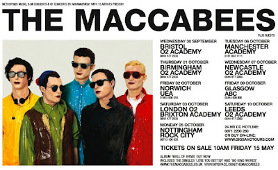
This poster is advertising the Maccabees tour and promoting their album. At the bottom it says 'wall of arms out now' which promotes their album, whilst giving lots of different city tour dates. The typeface is emboldened on the name of the band at the top of the poster, in significantly larger font. This allows the viewer the see clearly straight away what band the poster is promoting. The tour dates are all in black font against a white background, keeping it simple and easy to read. The text is larger or smaller due to which information is the most important, for example, the names of each venue of the tour are in larger font, making it clear and visible to see, and the writing at the bottom of the poster is smaller, because this is of less importance.  ‘Tickets on sale Friday 15 May’, this is emboldened in large font at the bottom of the poster, because it is one of the most important pieces of information, therefore it needs to be easily visible to see. The image is the same image used on the album cover. This makes it clear to see which band the poster is promoting, as it links in with their brand image and is easily recognisable to a fan, or someone who has seen or bought their album.

Advert Analysis - Arcade Fire


This is an advert for Arcade Fire, advertising their tour and album. There is little text, only at the bottom corner stating the dates and places of their tour and the band name. The band name is in significantly larger font, in order to stand out and be more visible. The colours of the image are eye-catching, beginning with one half of the picture as black and white and the rest bright and bold colours. This could signify the different moods of the songs of the album, for example, half of the album could be happy, fast-paced songs, representing the bright colours, and the rest could be slow and somewhat depressing, representing the black and white.The image on the poster is unusual and unique. There is a collage of images of a man with a sad/worried facial expression, and a superimposed image of a woman sitting in her lawn, which typically looks like a suburban house, which links into the title of the album, ‘the suburbs’. The man in the two images appears to be wearing a suit with his hair slicked back, and his facial expression suggests he is depressed or bored of the monotony of his suburban life, assuming that the woman superimposed on the image is his wife. The image is ambiguous and it is not clear what the photographs mean or represent. There is text at the top of the poster, which is lines repeating the title of one of their song 'rococo'. The vibrant colours and unique and interesting images make this poster stand out in contrast to other band advertisement posters.

Advert Analysis - One Republic

In this advert for One Republic, it is advertising their new album, “dreaming out loud”. The colour scheme in this advert is black and bright white indicating the night theme.
The background is black indicating darkness with bright white stars, an ideal setting for dreaming. The prop of the moon indicates its night time when you are normally asleep, “dreaming” linking it back to the title of the album “dreaming out loud”. The information on the advert is very limited, however the text that is on the page is the important information as it tells you the name of the band, the release date of the album, the name of the album and also the titles of their latest singles they have included so it attracts the target audience to buy their new album. On the advert “One Republic” is in large white font larger than the other font on the advert, it is also placed at the top of the page, this is to make it stand out from the rest of the text on the page so the target audience are aware whose album it is. The font is also surrounded by an elaborate border making it stand out even more to attract the target audience. The image of the tree glowing in the bright white light appears to the audience that it could be lit up by electricity indicating that the alternative genre of the band produces electric music.

Advert Analysis - Kings of Leon

In the advert for Kings of Leon it is advertising their new album “come around sundown”. The colour scheme includes yellow and white font which are bright colours indicating the significance to the name of the title of the album the word “sun”. The image in the background shows the sunset of the sun linking it with the title of their new album. The advert has limited text. The only text it has is the name of the band, the release date of the album and the name of the album. This is because it helps it stand out on the advert so the important information is shown to the target audience. The use of the silhouette of the palm tree branches indicates to the audience that the sun is going down referring to the title of their new album “come around sundown”.

The use of the shadows on the text, indicates that the sun is shining on the words, this also backs up the name of the album, "come around sundown" linking everything back to the album covers name.
From analysing this advert I will consider the simple layout and structure and the typical use of indie colours that have been used, when creating my advert. I will use limited text, as the important information needs to stand out.

Thursday, 29 September 2011

Narrative Theory

Tzveten Todorov: Narrative theory

Russian Theorist, Tzveten Todorov, suggests that all narratives follow three steps.The theory is that successful music videos begin with an equilibrium; a balance. Then an occurance happens which disrupts that balance. In the end of the video, the problems get solved and order is restored, and there is a peaceful balance again, a new equilibrium. Some music videos, however, go against this theory and do not begin with an equilibrium, and can still be successful.

Our music video does not strictly follow Todorov's theory. Our narrative begins with no balance from the beginning, as the narrative begins with the main character addicted to gambling and the girlfriend is fed up. This is because we wanted to show that his addiction and their problems in their relationship have been going on for a long time, and there is no happiness within the relationship anymore.The occurance in our video is that the girlfriend finally leaves him, which could be a new sense of balance and equilibrium for her, as she finally gets out of the relationship she is not happy in. However, for the main character, there is no resolution for him, as he is still addicted to gambling and in a sense, his whole world has fallen apart and he has lost everything - his money, his home and his girlfriend. We did not end our video with the main character being happy and everything resolved, because we wanted to avoid romantic chliche.

There are usually binary oppositions in a successful music video; good vs. evil for example. In our music video, we have a basic binary opposition of happiness and sadness. The girlfriend in the video is sad and annoyed, however the boyfriend fails to see that he has a problem with gambling, and is fairly happy with things before his girlfriend leaves him. We have also thought about use of light and dark to create a sense of atmosphere and to show how the characters are feeling. We have used use of darkeness surrounding the man to symbolise how he is feeling and how his world is getting destroyed. We have also linked the use of light and dark to connect with the lyrics 'darker side', and we have one side of the mans face in darkeness and the other in light. This can also link to the fact he has split personalities, eg. the 'dark side' is his gambling addiction and the light side represents how he was when he was a loyal and loving boyfriend. On the other hand, the girlfriend, once she is out of the relationship and she is finally happy, we will how her in a brighter light to symbolise how she is feeling.

Storyboard

Frame 1

Frame 2

Frame 3

Frame 4

Lyrics - Milburn - What will you do when the money goes?

Lyrics

Logo

The reason why we chose this design for the logo was the following:
  • Catches the readers eye.
  • Nothing fancy, just nice and simple for our target audience to read.
  • The colour scheme relates back to the genre of our music video  which is Indie.
  • The font which we chose was very stylish but again wasn't  to fancy as we just wanted a basic but effective logo for our music band.
Logo

The feedback we received from our target audience about the logo was very encouraging. The following are comments about what they had to say about our logo:

  • The different font styles made the logo very appealing.
  • The use of black for the colour, gave a good impression that the genre was Indie.
  • The use of the "&" character instead of using the word "and" makes the logo look very stylish.
  • The layout of the logo is very clever and appealing.

Friday, 23 September 2011

Diary Entry - Week 2

Diary Entry: Week 2, day 1
Today we made the blog and sent email conformations out to each person in the group so we can all access the blog separately and each make our own posts.

Diary Entry: Week 2, day 2
Today we looked at music videos from our genre and took ideas and thought about how we could develop and include them in our own project.

Diary Entry: Week 2, day 3
Today we developed a logo and band name, which will go on our storyboard. In the end, we settled with the name ‘Genius and the Tramp’ as we thought this was the best and most appropriate name for our genre and song.

Diary Entry: Week 2, day 4
Today we started to make our storyboard. We made a brand new storyboard with our individual logo on. We did the first few shots and worked out timings and lyrics for each scene.

Diary Entry: Week 2, day 5
Today we worked on the main part of the storyboard. We worked out the timings of the song and wrote what lyrics and shots would be in each scene.

Presentation Pitch

Thursday, 22 September 2011

Possible Songs

We considered all of the following songs before deciding on the song we were going to choose. These were:

  • Arctic Monkeys - Potion Approaching
  • Cajun Dance Party - Colourful Life
  • The Maccabees - Happy Faces
  • Milburn - Lucy Lovemenot
  • Milburn - What Will You Do (When the Money Goes)
  • Miles Kane - Kingcrawler
  • Miles Kane - Quicksand
  • Mystery Jets - Veiled in Grey
We eventually chose Milburn's 'What will you do when the money goes' as we felt our ideas for this song were the most appropriate. The reason why we chose this song was because the lyrics that were in the song, matched well to the stroyline that we had in mind. The lyrics were very simple to use and we were able to think of creative ideas to include in our music video.


Tuesday, 20 September 2011

Diary Entry - Week 1


Diary Entry: Week 1, day 1
Today we found out what group we are in, and we discussed and researched different songs and genres we could use for our music video.

Diary Entry: Week 1, day 2
Today we discussed and decided on which song to use for our video. In the end we settled on the song ‘what will you do when the money goes’ by Milburn as we thought this was the most appropriate to develop a storyline for and everyone agreed on it.

Diary Entry: Week 1, day 3
Today we thought about the narrative to our video and discussed ideas we could use for our video to make it unique and interesting, whilst linking into the song lyrics. We decided to use the theme of money and addiction, as this was appropriate to the genre and lyrics, and we thought we would be able to produce and interesting storyline with this theme.

Diary Entry: Week 1, day 4
Today  Michael and Matty began to create a brainstorm of initial ideas for our project, which included shot types, costumes and mise-en-scene ideas. We hand wrote this and scanned it into the computer in order to put it on the blog.

We worked on the pitch for our song/band and finished the initial ideas. We hope to finish the pitch for next lesson. Outside of lessons we are working on completing six analysis each od adverts, digiacks and music videos, and thinking about how they can influence our own project.

Diary Entry: Week 1, day 5
Today we gave our pitch to the teacher. The pitch went well and our ideas were accepted. We next aim to develop our ideas further and start to make the storyboard.


Michael's Top 10 Music Videos

Matty's Top 10 Music Videos